
Web design: What’s to come in 2015
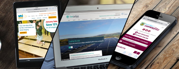
If you were to look at our portfolio of websites over the years, there’s one main thing you’ll notice… the evolution of web design.
Over time we’ve seen web design trends come and go, and being on the forefront of web design ourselves, it’s important for us to stay ahead of the game. So, what’s to come in 2015? Let’s take a look…
The pretty stuff…
Simplicity
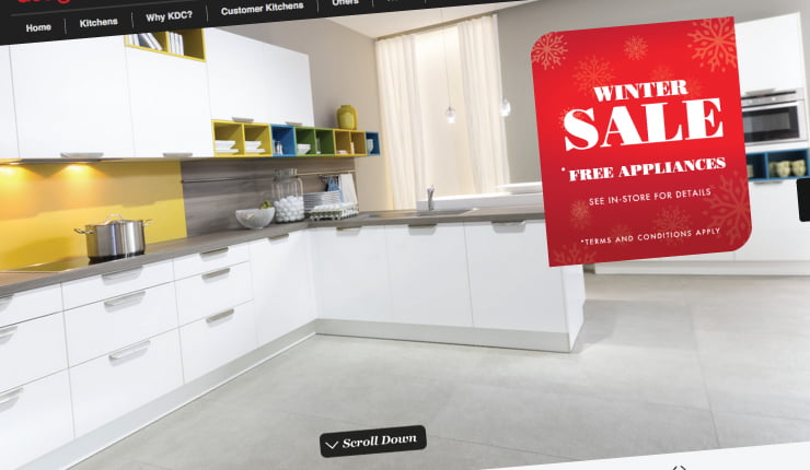
What’s the first thing you see when you log on to a website? It’s more than likely to be a company name and a bold header image… but not for much longer.
Recent designs have shown that some brands are moving away from this tradition and are ditching bold header images for just larger header text instead – giving both a clean crisp look and faster website load time. For 2015, it looks like clean and simple sites are in and busy, design-heavy sites are out!
Storytelling
What better way to engage a customer than telling them a story and drawing them into your brand? Telling a story through the use of content, imagery and fancy web design helps make a site more appealing and ensures vital interaction that’s essential for success!
Priceless photographs
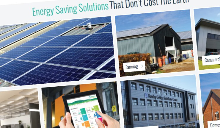
Good quality, original photographs are more important than ever now on the World Wide Web. While stock imagery still has its place, unique photographs directly relating to your brand, your products and the people behind your business are becoming more and more important.
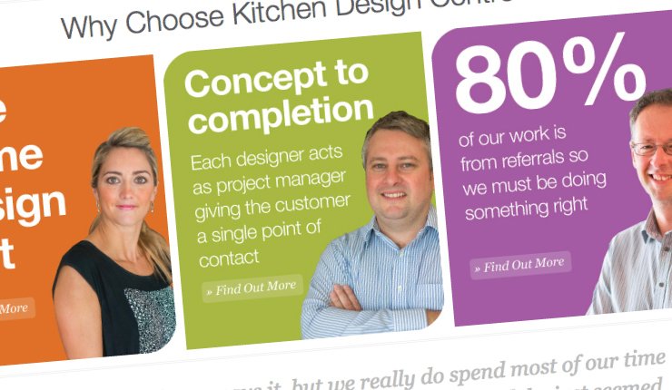
Stand out typography
Typography has become increasingly important in a number of industries over the last few years, one being web design. This year, it looks like headings will be getting even bolder and larger, highlighting statements that are key to a brand.
The practical stuff…
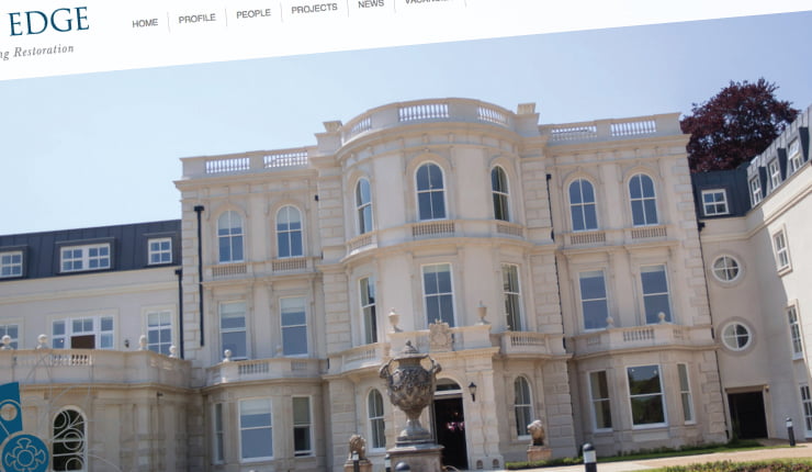
Centred fixed width layouts
In 2014, full width websites, whereby images and text visually stretched to the full width of a browser, were in. In 2015, the older fixed width idea seems to be making reappearance. By fixed width, we mean that all the content is centered in the middle of a page with a clean, wide border around the outside.
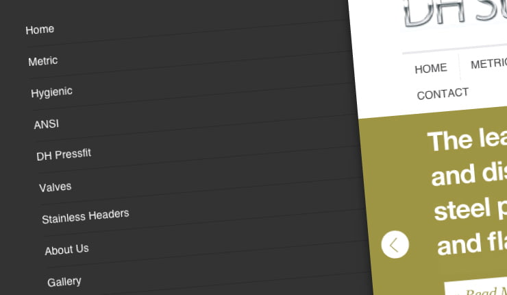
Hidden menus
While you may be used to navigating your favourite websites via the menu toolbar at the top of the page, they may not be around for much longer. Some brands are replacing traditional main menus with pop out ones – much like an app, typically located on the side or corner of a screen.
Scrolling sites
So we know that the bootstrap framework already gives you that slick, scrolling site but in 2015 we expect bigger and better things in terms of scrolling. While the feature predominantly applies to just homepages at present, it’s likely to be used across websites now on every single page.
Better performance and speed
Web designers are now responding to viewer’s frustrations by creating websites that not only look good, but load faster too. With stylish designs came slower loading times and poor interaction but in 2015 design decisions are set to make this change. Designers and developers will be playing closer attention to the size of their files and sites, how fast their site loads on different speed networks and will become more mindful of those on limited data plans.
Fancy giving your website a modern refresh for 2015? Get in touch with the 21 Digital team for a no obligation chat on 01254 660 560